


British Columbia retires vaccine outcomes page, points people towards official disinformation

Welp, the last province has thrown in the towel. British Columbia has stopped tracking outcomes by vaccination status. They point people to a page that claims both that the vaccine provides “good outcomes” against severe COVID-19 and that the booster is even better!


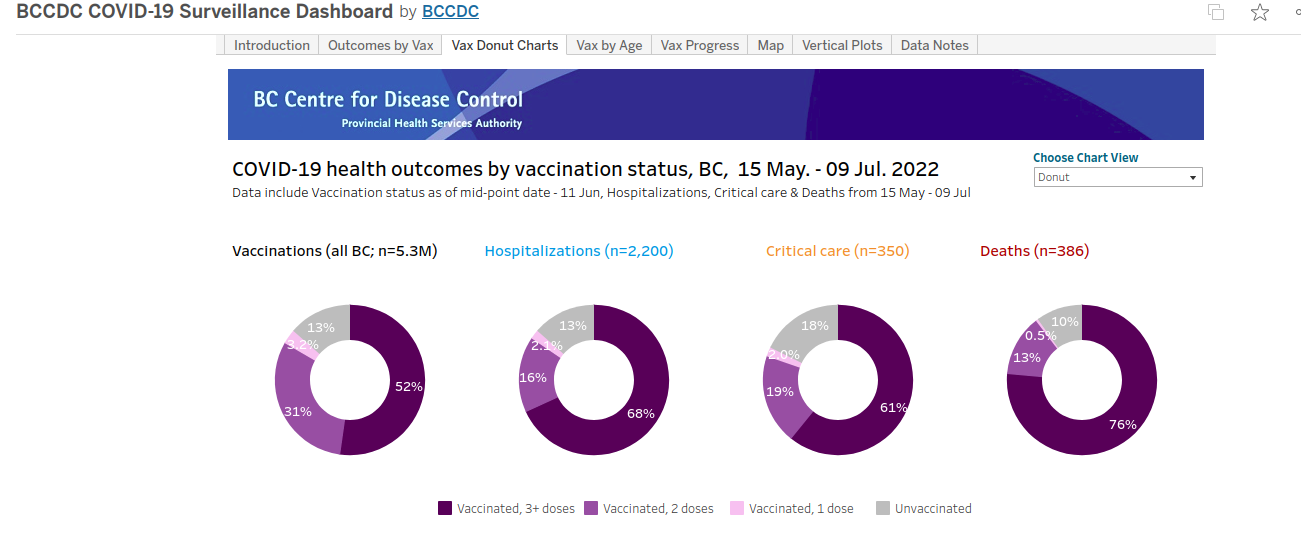
That’s interesting! But I was on the BC CDC website literally the day before it shut down and noticed something quite interesting: 90% of all deaths were in the vaccinated population from May 15th to July 9th.
Now, I am sure the vaccine enthusiasts will argue Simpson’s paradox. BC was on top of that, too, as they provided age-adjusted rates.

Looks fine for hospitalizations and critical care; however, it is a far cry from their claim. For deaths, it also looks alright for the vaccinated… right? But if you look closely at the confidence intervals, they all overlap. They cannot say with confidence that there is a statistically significant difference between being unvaccinated, fully vaccinated, or boosted.
Now, there is reason to be skeptical about the hospitalization and critical care numbers. In British Columbia, those in care homes that are receiving hospital-like care for “severe COVID” are not considered hospitalizations. This has been a problem in the province (and possibly other provinces) since the start of the vaccination campaign.
An argument could be made that people in care homes have worse health in general, which would have the effect of skewing outcomes in this demographic. That may be true — though, the inverse may be true in younger cohorts. Frankly, I do not know what the underlying comorbidities look like in these groups, and if they are different, why is BC adjusting for age in the first case? Why not just admit that no comparison can be made and we have no idea whether the vaccine is effective or not?
In any case, the hospitalization/critical care rates and death rates must be quite confusing for those that do not know that the province does not consider those with “severe COVID” in care homes to be hospitalized. The difference would imply that the vaccinated are less likely to be hospitalized from the virus but more likely to die if they do get hospitalized.
The BC data, for its part, did have one advantage: they calculated their population denominators completely differently than any other province. Instead of using inaccurate population estimates, they extracted the numbers from the 2021 BC Medical Services Plan database. While the numbers are by now a year out of date, there is not the same skew in the elderly populations as in other provinces.
This data is interesting in and of itself as there are about 250,000 more people in the MSP database than are captured in the latest census. If this holds true in other provinces, then vaccination rates may well be overstated by quite a lot in the country even after adjusting for census data.
Better data quality (in terms of population denominators) may be the reason that the age adjusted rate of deaths were not as extreme as in provinces like Alberta or Ontario who had extremely inaccurate numbers.
Anyways, I will be posting an article on the effects that inaccurate denominators can have on age-adjustments in the next couple of days, but wanted to provide this update as provinces seem to have completely their information blackout. This could be good come fall as it may be a policy shift away from COVID hysterics and into reality, but it may also be dangerous as people have set their beliefs on inaccurate information and health authorities seem all too happy to reinforce those beliefs. If the numbers had been favorable for the vaccine, they would still be published and used as a blunt instrument come the fall wave. Instead, they will be forced to rely on myths and old tricks to convince the populace to get their boosters because the vaccine is “safe and effective”.
Other questions that pop up in my mind:
1. Are both UV and V tested when coming into hospital?
2. Are PCR tests spun at the same rate?
3. Where are the "unknown" numbers? In Ontario, the piecharts always looked favourable when compared with the proportion of the population vaccinated or boosted. But when looking at the raw numbers, this was not the case. The unknowns never appeared on the pie charts. When looking at the raw numbers, the unknowns almost always outnumbered the unvaccinated, and by a long-shot. When presuming they were in fact vaccinated (according to the M of H definitions of unknowns), the proportions changed significantly also, showing almost zero effect for the shots. This is similar to what Alex Berenson was shining a light on in Israel and the UK last summer.
So many questions. Such murky data (as said by Astrid Stuckelberger in 2021).
As I remember, they define a death as anyone who died within 30 days of testing positive. They only have to test the unvaccinated more to inflate the number of deaths.