


How to lie with statistics: Hong Kong vs New Zealand edition

So, there is this article from Financial Times making the rounds titled “Hong Kong Omicron deaths expose limits of fraying zero-Covid policy”, which is a bit of a mouthful, but it certainly piques the interest, don’t you think? But, no, it is not an anti-lockdown ballad; rather, the article is aimed at convincing the reader that Hong Kong’s great failure was both not vaccinating enough and using the wrong vaccines.
Sigh.
I must admit that I have been avoiding critiquing these pieces lately, but I wanted to touch on this particular article. The authors seemingly add a flavor of nuance by pointing out low vaccination rates in the elderly, not the young, is the reason for Hong Kong’s failure. Which, while still not a justification for vaccine mandates in the elderly, is at least further away from the “we must vaccinate the children to save grandma” Reddit-type argumentation we have been hearing for the last year.
Here’s the kink: the authors conclusion stems from the comparison of Hong Kong, a country with a low vaccination rate in the elderly, to a curated selection of other countries with high vaccinations in the elderly. As I have noted for a long time, comparing the vaccinated to the unvaccinated is troubling in the best of times — these are two distinct populations with completely different characteristics. The authors do not even do that; rather, they compare different countries and designate the countries as, essentially, vaccinated and unvaccinated. In the article, and the authors subsequent Twitter thread, it is not even clear they understand these countries are different. Indeed, very different.
Let’s take a look. Here is a graph from the Twitter thread that compares Hong Kong and New Zealand:
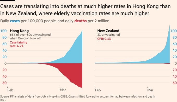
Now, this is one of the most ridiculous graphs I have seen in awhile. Where should we begin?
The first thing that stuck out to me when I first saw it is there are two different rates on the same graph. For cases, they use “per 100,000” but for deaths they use “per 2 million”. This is a common tactic that we have seen throughout the last two years, which has helped cement the idea that we need restrictions in the first place. The problem here is that it the authors are trading perspective for visual appeal. People look at this graph and see a magnified death rate and a zoomed out case rate. If we did the same but in reverse, say, case rates per 2 million and deaths per 100k, the opposite effect would occur. But we would be rightly criticized for data manipulation for doing so.
Yet, that is one of the less controversial parts of the graph. They mention vaccination percentage from the start of the wave. However, that is not the current vaccination percentage, and it actually severely impacts what we are looking at. Hong Kong, unfortunately, did what we have been screaming never to do. They vaccinated into the wave. 21% more people over the age of 80 have been fully vaccinated since this wave began. That’s a serious problem as we have seen negative effectiveness against death in the first 14 or so days (most notably, in the Alberta data) of the first dose. I do not want to get into speculation as to why that may have happened, but best case scenario is the immune system is temporarily weakened after the shock the vaccine has on their bodies and they catch the virus more easily. Now, these people are doing that twice against a vaccine that does not prevent against transmission in the first place.
Frankly, the data in Hong Kong is bad to the point where it is comical, so it is impossible to say what kind of effect vaccinating had on the wave. They claim that most deaths were in those without two doses, yet, we don’t have a strong definition of what that means. 14 days after, 21 days after? We simply don’t have the level of granularity needed to make a judgement on what is happening here, but I will assume it is following similar trends to what we have seen before except omicron may be making the situation worse for the newly vaccinated after both their first and second doses, giving it twice the opportunity to inflict damage.
The authors also decided to move the cases forward to account for the lag between cases and death — problematic as, of course, different living conditions and standards of care will severely impact any lag factor.
But notably, the numbers are just plain wrong. The given case rate is wrong. The case fatality rate is 10x lower. And there is reason to believe cases are being under counted in Hong Kong due to the sheer volume of new cases. Are you freakin’ kidding me?
This is not just a Hong Kong problem, either. Highly vaccinated South Korea is apparently beginning to have the same problem and their deaths are beginning to spike as well.
We could, honestly, stop here. The authors of this article might as well have manipulated the data as there has been no correction. But I want to quickly discuss why the premise of comparing these two populations in the first place is wrong.
We need to discuss the differences in the population.

Here are the age categories in Hong Kong and New Zealand in terms of the percentage of the population. As can be seen, Hong Kong is much older than New Zealand. 5.4% of the population in Hong Kong is over 80 compared to 3.88% in New Zealand.
Only 0.64% of the cases in New Zealand (as of Wednesday) were in those over 80. Whether that was through luck or by keeping the elderly isolated, there would be no reason to see a huge spike in deaths in New Zealand. Hong Kong, on the other hand, does not have that luxury. The population density is high, homes are more likely to be multi-generational, and conditions are more likely to be worse. Even the media has picked up on it, this article where all six family members got a fevers while isolating on the “rooftop shanty home” is a perfect example of how conditions differ in Hong Kong.
The low case counts in the elderly in New Zealand is also not because they are more vaccinated and the vaccine is reducing transmission. Since February 15 (until March 17), there were:
331,928 cases in the fully vaccinated (133520 of which were boosted)
5,392 in the partially vaccinated
77,245 in the unvaccinated (60,110 of which were not eligible for vaccination)
That means around 81.4% of cases were in the vaccinated. The population is 78.44% double vaccinated and 49.5% boosted (around 20% of those got boosted during that time period, so their cases were likely counted against the double vaccinated). Strangely, the partially vaccinated were under represented in the above numbers, probably because many of their cases are counted as unvaccinated. 4.6% of the population is partially vaccinated.
I could not look at this for those 80 or older, but for those 70 years or older, who make up around 2% of new cases despite being 11% of the population, they make up 20.16% of new hospitalizations. If the cases were hitting these age groups proportionally, deaths would likely rise proportionally.
The Hong Kong data is even worse, but the eye test simply tells us that a greater proportion of the older population has been infected. It looks like 9-13% 70+ depending on the breakdown of test types to me. Or about 5x higher than New Zealand…who have a CFR 5x lower. See the two charts below:


In other words, a significantly larger proportion of the older population has been exposed. That, along with the data manipulation/error, makes the entire analysis moot. We need to compare apples to apples, and we simply cannot do that without better data.
Lying only ever begets more trouble, especially when people having to work using skewed or fraudulent or even misleading data make their decisions based on them.
In Sweden, the majority of Covid deaths as confirmed by post-mortem testing, was elderly with at least one other comorbid factor such as diabetes or hypertension et c - and migrants from MENA and Africa, especially somalis and ethiopians (seems viruses and biology doesn't care for liberal "there are no biological racial differences"...) which sustained a lot more ICU-cases and deaths than their numbers should have, all else being equal.
And when looking at the remaining casualties, virtually all of them have comorbidities such as being immunocompromised or being morbidly obese (the idiom/colloquialism for that being "as fat as an american"). The number of cases where an otherwise healthy normal person has gotten Covid and died from Covid infection, is in double digits or fewer.
I wonder what the NZ/HK figures looks like when such things are factored. What're the rates of COPD in NZ and HK respectively, for example?
Thank you for doing this analysis. When I first saw those graphs on Twitter, I could not believe what they were showing.