


New York, New York
A pandemic driven by the vaccinated?

So, this image of New York State vaccine data has been making the rounds to prove the vaccine remains effective in the face of Omicron. Of course, no context to the image is ever presented.

First of all, New York State considers the unvaccinated anyone that is partially vaccinated or those in the first 14 days of the second dose. This serves two purposes: it artificially inflates the cases per 100,000 in the unvaccinated and underestimates the cases in the vaccinated. This is a common trick among vaccine enthusiasts, and shields the vaccine from the initial negative effectiveness of the vaccines. Since November 8th, 6.7% of the state population has had their first dose, so the negative effect would be significant. The farther we go into 2022, the less the vaccine enthusiasts will be able to take advantage of this effect.
Also since November 8th, 45% of cases in New York have been fully vaccinated, by their definition. Over that period, around 68% of the State has been fully vaccinated. We have no real anchor to compare the cases against, though. We could point out that 6% of the state population has tested positive for the virus in that period of time and only 3.8% of the vaccinated population has tested positive.
Not bad, right? The vaccines must be working? Well, here’s the rub.
In the absence of good information on who the infections are occurring in, whether they are occuring in the unvaccinated, the partially vaccinated, or the fully vaccinated in the first 14 days, it makes sense to look at where the infections are occurring. Below is a plot of the percentage of the population considered “fully vaccinated” by New York State on the y-axis, and the percentage of the population that has had COVID since November 8th at the county level.
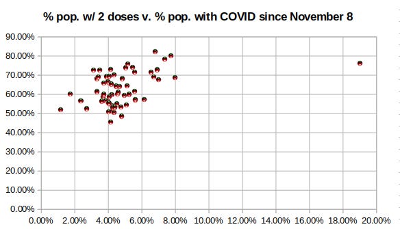
Interesting, right? The counties with the lowest vaccination rates have had the least infections in this time period. The counties with the highest vaccination rates have had the most.
Well, here’s another graph. This time on the y-axis is the percentage of the population that has had COVID, and on the x-axis is the percentage of first doses per total population since November 8th by county.
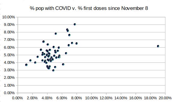
Uh oh. Same effect except to a higher degree. The higher the percentage of first doses in a county, the higher the likelihood that someone gets COVID. That’s not the unvaccinated driving anything, nor is it the vaccine working. That is a pandemic of the vaccinated. Worse still, the proportion of the vaccinated getting omicron is increasing rapidly and will soon look a lot like Canadian provinces (where the vaccines have been holding steadily at negative VE for a couple of weeks now), so not only did the vaccinated drive the wave, they will soon fall victim to it.
Or maybe this trend only exists in New York and only for this period of time. Who wants to take that bet?
A question for people who are indiscriminate Covid vaccination proponents- Why do we need to rig the vaccine effectiveness data if the vaccines are working?
Couldn’t the converse also be true? Namely that, the higher the case counts, the more new people went and took the vaccines? That seems pretty reasonable or at least it’s likely to explain some portion of the affect.