
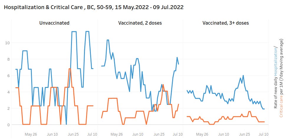
One last snapshot of the BC data
Check out the last screenshot. Yikes!

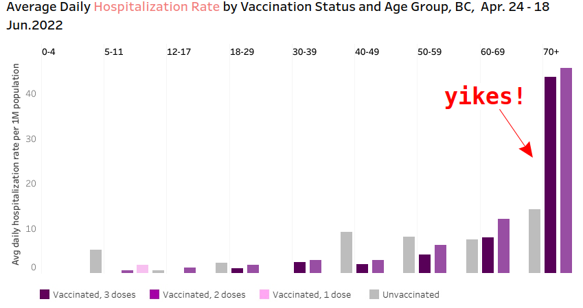
For those interested, here are the final four screenshots I captured before the BC data was “retired”. Notice on the third screenshot, the unvaccinated data was missing and/or redacted. The fourth screenshot may explain why. Sorry that the time periods are different in each graph — the line charts did allow me to select time period, but I honestly was blindsided by the data being there one day and gone the next with no archive available.


Edit: Do I have egg on my face?
Rob Wood points out:
“It seems to me that on the last chart, the gray ('unvax") bar belongs to the group to its LEFT. This implies that there should be more information to the right of the chart's edge for 70+. There is a faint gray vertical line separating the age groups. In this case, the bar order would also match the order of the series given in the legend. This is also consistent with the fact that the chart above it, for 70+, is missing a series for the unvaccinated.
Either you have misread the final chart, or I don't understand your argument? So I'm confused.”
By the by, for those who are wondering if the rate in the 40-49 group "makes up" for the rate in the 70+ group, I did some napkin math with pixel counting using the datasets population as the standard population. Age standardized rate of hospitalizations per day per million using their data is 6.1 for the unvaccinated, 8.7 for the booster, and 10.2 for the double vaccinated.
It is not surprising that the government does not want the people to see this.