


The trick
From data manipulation to booster failures.

The last two years have been an interesting exercise in attentiveness. It is almost fitting that public health press conferences have been dominated by the people in the corner of the screen, nimbly translating the words into sign language. For, all things considered, most of the information we have been given involves at least some sleight of hand. But instead of treating us, the consumers of media, to a magic trick, the entire performative act is just a trick. Once you begin to see how the trick is done, though, their routine becomes easier to dissect.
I first noticed this particular trick in September. I’ve briefly mentioned it a few times on this Substack, but I wanted to point it out a little more explicitly. Alberta Public Health provides a near daily update on case numbers during the work week. These days, the most interesting thing to focus on is the summary statistics.
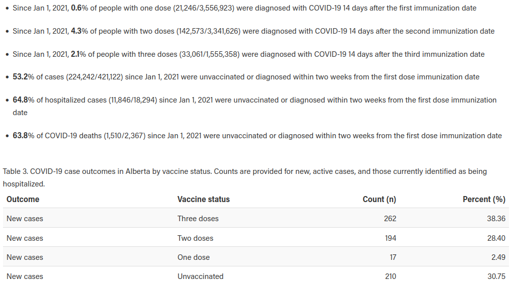
Notice above, we have the total number of cases since January 1st, 2021 broken down by vaccination status. Do not worry that some of the cases in the vaccinated are being counted as unvaccinated. That is a wholly different trick. They also provide a count of new cases, broken down by vaccination status, that updates every day.
Those that pay close attention to these numbers will be surprised that new cases in the unvaccinated for the month of February have not dropped below 23.74% on any given day and have been as high as 34.43%. Yet, active cases in the unvaccinated have hovered around 19-20% for the entire month.
Strange, no? Are the unvaccinated just getting over the virus faster despite what we’ve been told? While we don’t observe that, we can track the changes in total cases on a day by day basis by recording them every day. We can then compare those numbers to the new cases provided to us on the same page. When we do so, we end up getting data that looks like this:

Yikes.
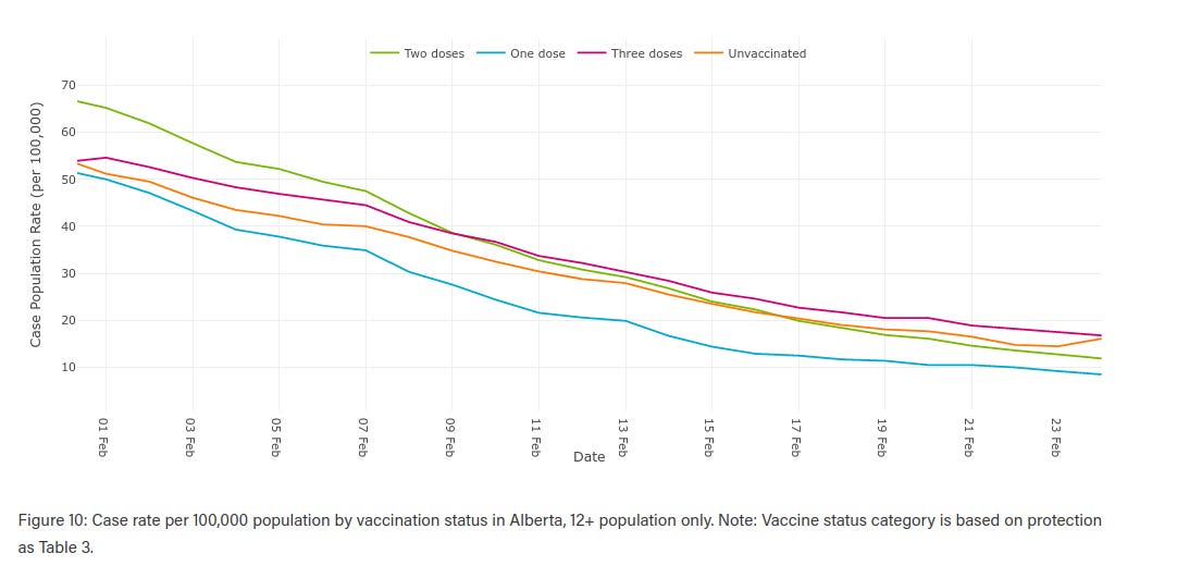
The above graph has huge disparities between what is being reported, ie., what people’s eyes are most likely to focus on, and what the actual changes to the totals are. Furthermore, if people are focusing on new cases, another question that arises would be why the case rates per 100,000 population in those with the booster have been higher than in the unvaccinated for the entire month of February (see graph below).
Well, we can do the same thing by looking at the share of new cases with a booster and voila — same result.
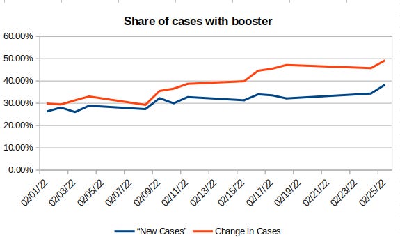
The share of new cases in those with a booster has been grossly under-reported every single day. This is not a mistake. If there were minor adjustments, the changes would not be off by up to 15% (consequently, that 15% change translates into the new cases in those with boosters being under-reported by 47%).
Nor would they always favor the vaccinated to the detriment of the unvaccinated. This is a purposeful ploy.
What the reasoning is besides manipulation is unclear. Perhaps those with unknown or unconfirmed vaccination status are being placed into the unvaccinated bucket? In any case, there is no warning given anywhere by the health authority, and the media has been reporting on new cases off this site from the “new cases” chart for the entire vaccination campaign. Meaning, every single update in the media has been inaccurate, which has been used to further bludgeon the unvaccinated (on top of a host of other bludgeons).
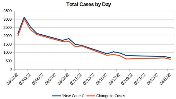
To that point, total cases by day have also been consistently over-reported — and I do not believe I have seen an example where they were under-reported. Again, one would actually expect the change in cases to outpace the new cases data (ie., cases that were missed). Are they artificially increasing the number of cases? To what end? I don’t have an explanation for this one. The changes may seem small in the graph below, but that amounts to an 8.4% over-reporting of cases over the month.
In any case, this is just a further reminder that what you see is not always what you get. Pay attention. Even small variations can lead to large changes.
Great analysis. Thank you for taking the time to do this and to share it with us. If only the media would do its job and actually examine how the numbers are calculated, instead of just parroting what the government reports. Am so disgusted how the unvaccinated numbers have been so wrongly reported.
Very interesting. The more you look the worse it gets, there’s lies on top of lies, and I’m sure every step of the way the public health authorities convinced themselves their deceit was for the public good.
I’d love to see the raw data without the 14 day offset, and without any unknown vaccination status cases. My guess is the shots have essentially no efficacy against all cause mortality when balanced against the side effects and the fact you still catch COVID.