What Alex Berenson is missing in the Alberta data.
When I first started publishing this stack in October, I made sure to post some of the most intriguing graphs in the entire pandemic. They were October versions of the graphs that Alex Berenson posted a few days ago. These graphs are incredibly important and I applaud Alex for bringing attention to them. Essentially, the shape and nature of these graphs prove the early period of vaccination has negative effectiveness that the regulators, and vaccine manufacturers, unceremoniously want us to forget about. Even under the assumption that some of the effect is latent healthy vaccine effect, it is difficult to imagine the effect being that large. Other than vaccination itself creating a negative immunological response, there is little that can explain the uptick in cases, hospitalizations, and deaths. It is an important point that I have tried to hammer home a few times now, yet the situation on the ground has changed and there is an even more important point to make.
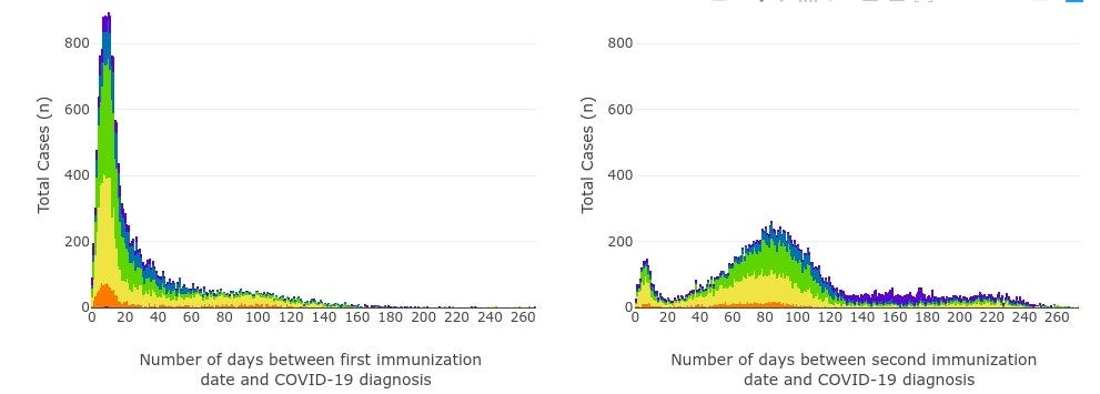
We must remember that the data manipulators are illusionists. Yes, when they accidentally reveal one of their tricks, we must pay attention, but they are full of tricks. Sadly, Alex only posted the graphs for hospitalizations and deaths. In doing so, he missed out on something important. Below, I have re-created the days since vaccination status graph using what I scraped from the Alberta data soon before they removed the graphs.
The graph looks similar in most respects, but pay attention to the sleight of hand here. Something is off.
Here, perhaps a line chart will help more. As we can see, the cases in each age group follow a pattern. For all age groups but one, they peak between day 8 and 16 before sharply declining.
However, we are currently in the midst of a vaccination campaign in Canada for the ages of 5 to 11. The vaccination is, with scant evidence, being sold on the basis that it can prevent cases in this age groups. There is no argument for preventing hospitalizations and deaths because this age group rarely ends up in the hospital or dies from the virus. Yet the cases do not peak in this age group as we have seen in other age groups. The peak does not occur until day 34 after vaccination.
While the argument may be made that the vaccination campaign occurred during a wave (something that should never be done in the first place), other vaccination campaigns such as that in the older age groups occurred during the middle of the wave last winter. And many of the vaccine mandates, which Alberta claims were effective in spurring vaccination, also occurred during the fall wave.
Recall, though, that I told you to pay attention to the sleight of hand. The peak is not a sign that the vaccine has suddenly become effective. The peak is a sign of two factors:
Some percentage of the single dose 5-11 year olds have become fully vaccinated. This number is actually relatively small at around 1.5%.
Most of those that received a single dose had, in fact, not yet been included in this time period.
I hate confusing graphs, so a quick explanation of the above is as follows.
On the left hand side y-axis are cases, which are measured by the orange line.
The x-axis shows how many days it has been since vaccination.
On the right hand side y-axis is the percentage of the 5-11 population that has been vaccinated in total that has experienced the days on the x-axis. In other words, as all those vaccinated are included in the day 1 data, the black line will be 100%. Those that got vaccinated yesterday, though, will not have had 3 days since vaccination, which will cause the percentage to drop.
Hopefully that makes sense. Indeed, it seems from this graph that the peak has not been reached at all. One has to ask, then, where is the vaccine effectiveness to justify vaccinations in this age group? There is none.
And costs, Alberta? As the vaccination campaign continues, I would pay close attention to their adverse event page. Since January 1, there have been five more reports of myocarditis in the vaccinated.
This is exceptionally troubling as most adverse events are highly under-reported, particularly in Alberta where many doctors have been threatened with losing their license if they spread “misinformation or disinformation”. Others, such as tachycardia, have received little or no attention even in the refusenik crowd and will not even be listed here. We may actually have been luck finding the rate of serious adverse events in the increase in contraindications that are occurring now that the booster push has been initiated.


You may have to take over for Alex. He's in serious trouble with his substack subscribers. He basically threw Dr. Robert Malone under the bus on a segment with both of them on Fox TV.
Thank you for this. Have you seen the Scotland data? Shows vaxxed at substantially increased risk of hospitalization and death over unvaxxed. I never see anyone talking about this and they are among the few who post deaths divided by vaxxed status. Page 44 is hospitalizations and page 50 is deaths. I've seen this report referenced for cases but never looking at deaths.
https://publichealthscotland.scot/media/11223/22-01-19-covid19-winter_publication_report.pdf